Blog
Welcome

Recent posts
SEARCH RESULTS FOR: Pre-design

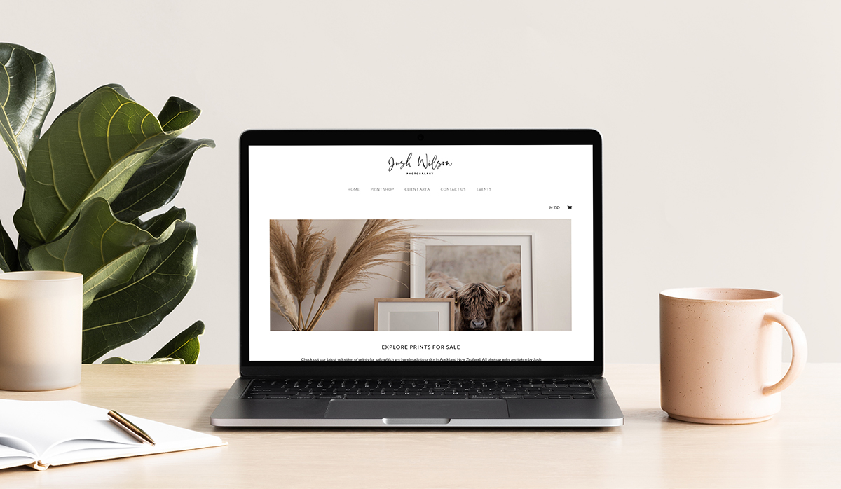
We’ve been thrilled with the response to the Print Shop launch — especially now it’s available on our super-affordable Lifetime plan! — and we love watching your stores go live. We’ve been talking with many users about how we can make it even better. As a result we’ve made a few design changes to elevate your store even more. Update 1: New store layouts We launched Print Shop with three layout options (square, landscape and horizontal). We've now introduced a fourth, a "mixed orientation" layout design — To View More >>

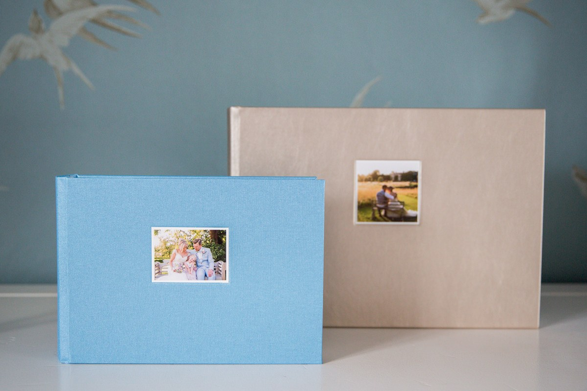
Apart from the fact that Katherine adores Queensberry albums, she personally feels you can’t beat printed images. In this day and age everyone (herself included) has thousands of photos on their phones, computers and social media accounts, but they rarely get round to printing the images. And yet when you hire a professional photographer the images are of such beautiful quality, it's such a shame to confine them to a ‘screen’, as they take on a whole new dimension when printed. Katherine gives us some sound album advice to ponder, interspersed with beautiful To View More >>

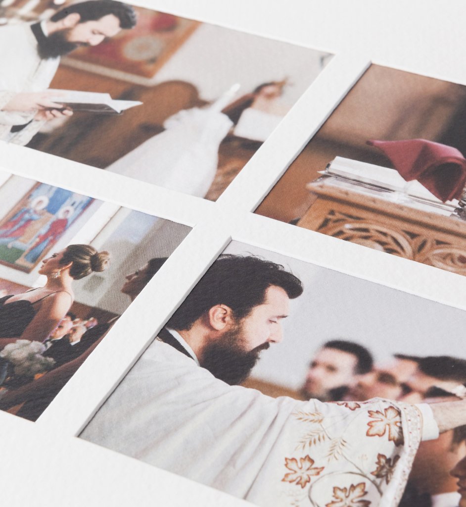
Pagemount vs Overlay We offer a few types of matted album — Overlay Matted, Duo and Musée —and one of the important differences between them is whether the prints are mounted Overlay or Pagemount style. So what's the difference? Overlay: Industry-wide, almost all matted albums are overlay mounted, so overlays may not be new to you. Details may vary from manufacturer to manufacturer, but the photographs are attached behind the mat, which covers and conceals the edge of the prints. You can see this clearly in the first photograph. To View More >>

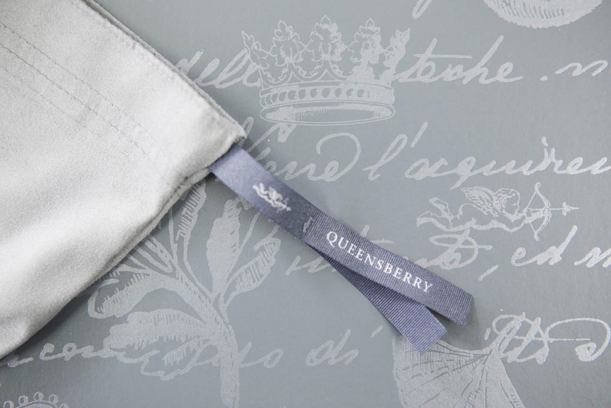
The presentation box our albums come in has a long history. Developed for us in 1995 by leading designer Donna Hoyle, it combines two graphic elements: a 17th Century Italian text, and a series of leaf and heraldic devices including our own Cherub. It doesn’t even bear our name, but to us, and our customers, it’s a key part of our identity, like Tiffany’s Blue Box… but maybe not as famous! The Box even survived a total rebranding in 2008, when we couldn’t bear to part with it. It was another seven years before we refreshed the design, and even To View More >>

Last week we were enjoying drinks and nibbles with some photographers in the Design Space, and they asked, why all the pictures on the walls? The short answer: We’re visual people and we need visual prompts. The long answer: It’s part of our design process. We fill walls with things that inspire us, projects we’re working on and ideas for the future. They remind us what we’re up to and where we’re going. Workspace has been our main focus as designers this year. We’re a small team, and it seemed a daunting task. “Where do we start?” we To View More >>


Email: info@queensberry.com
Free Phone Numbers:
New Zealand: 0800 905 905
Australia: 1800 146 251
USA: +18668350851
UK: 0800 808 5271
Canada: +1 855 581 0370